Rebrand Tuta #1: "Opening source code" of our new visual identity
Turn ON privacy. That's what we offer since day 1 of Tuta(nota). Now our brand architecture reflects this in a new app ecosystem.

A metaphor and its storytelling potential
At Tuta, we have a mission to not only offer apps but also promote awareness about security and privacy on the web. To this purpose, storytelling with figurative associations is a powerful tool to awaken people beyond a technical and rational explanation.
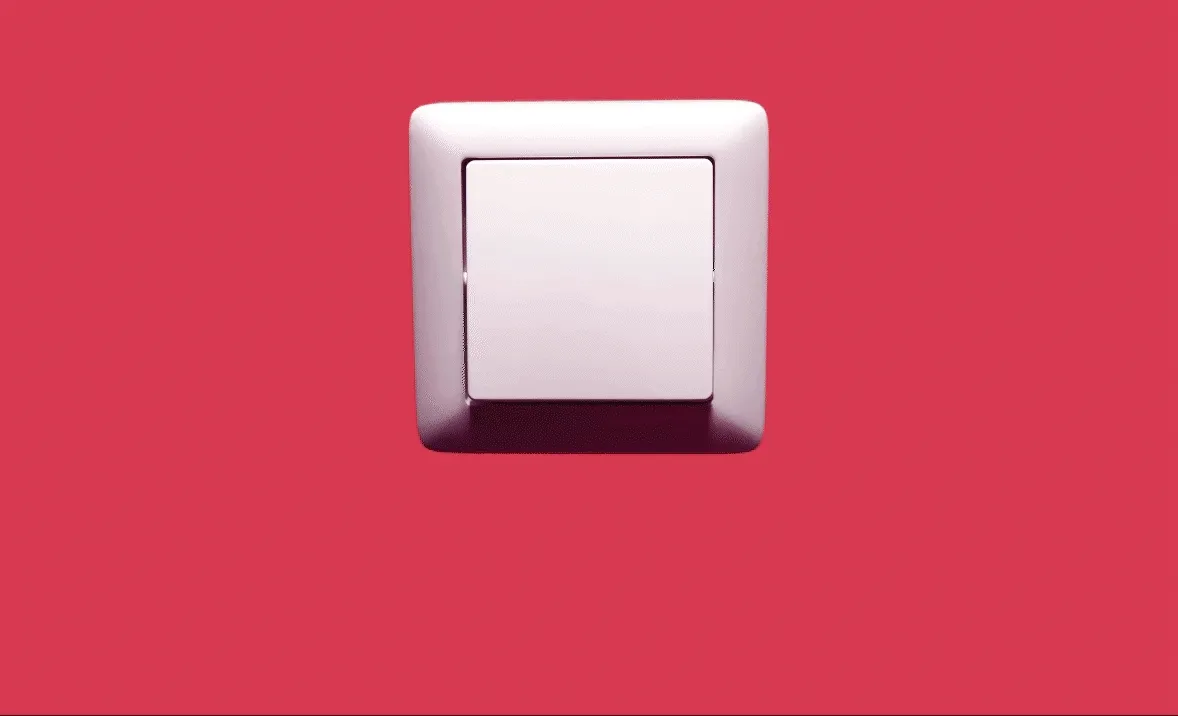
You probably flip switches so many times a day that you can’t even say for sure how many times, right? We do it so automatically that we don’t even realize it anymore. The web is a similar place. We simply do not think about it but expect digital companies to keep our data safe, for instance with encryption. That’s what we at Tuta do and what we promise all our users: Full control, in your hands.
Our completely revamped brand identity reflects exactly that. With a minimalist symbol, full of potential for storytelling, using more vibrant supporting colors, we’ve given the Tuta brand a modern, warm, and energetic look.

Step by step, you were able to see Tuta’s transition in a new creative direction. First we launched the logo - the switch - in the app and on our old website. More recently, we launched our new website with the new tagline: ‘Turn ON Privacy’. In this way, our visual narrative will connect with the basic function of this device: to switch something on easily. With the latest updates, we have completed an important part of our rebranding. The next steps will be to develop the new brand directly into the product.
Read on to find out more about our creative process, the concepts that guided each decision, and, most importantly, how this will bring value to the UX and UI of our products Tuta Mail and Tuta Calendar.
Brand creation process
Design is process, that means lots of iterations and route changes. So we took a winding path - as winding as the old logo - to arrive at the new symbol. On this path, we went through various concepts, from the visual clichés of cryptography (keys, padlock, shield, characters, etc.), and even animals as mascots. In all these options, something was still missing. Then suddenly there was a ‘click!’

Since Plato - or even before - allegories about light and shadow have been part of philosophy and literature, Plato’s own myth of the cave being just one of them.
The light switch that is used every day carries a lot of potential. It is a rich storytelling symbol, exploring the transition between public/private spaces through light/shadow. This relationship is not new, and in our process it was inspired by the ideas of Hannah Arendt - who, like Tuta, was born in Hanover. Arendt spent a long time reflecting on the private and public spheres, treating the former as the cozy shadow of the walls of the home - necessary for us to get back on our feet as individuals - and the latter as the daylight that proves we can live in community, the public space where we can develop our potential. For her, both spaces are fundamental to a fulfilling life.
A life spent entirely in public, in the presence of others, becomes, as we would say, shallow. While it retains its visibility, it loses its quality of rising into sight from some darker ground which must remain hidden if it is not to lose its depth in a very real, non-subjective sense.”
Hannah Arendt, The Human Condition.

It was identified as well that the metaphor of the previous symbol - a path to a relaxed feeling through encryption - had become too subliminal for our current positioning. With the new metaphor, we preserve the credo of the right to privacy, but in a more objective/material way: the user is in full control. Tuta not only opens the path to privacy, but it’s also an everyday privacy device, simple and easy to use.
During the process of auditing the old brand, we realized that most tech companies - particularly in the encryption/privacy - business, treat the subject with neutrality and coldness, and that we could bring more energy and human feelings to the new identity.
The new look should also better align with the voice of our brand, one that has always reflected a strong personality. This means we never give up maximum security, not even if it had a commercial advantage. With this in mind, the new creative direction sought to humanize and add warmth to the communication of a fight for this basic right: the possibility of choosing privacy.
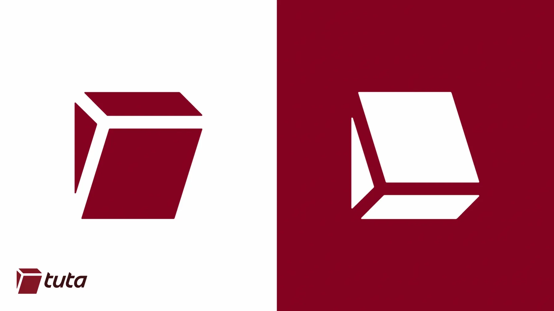
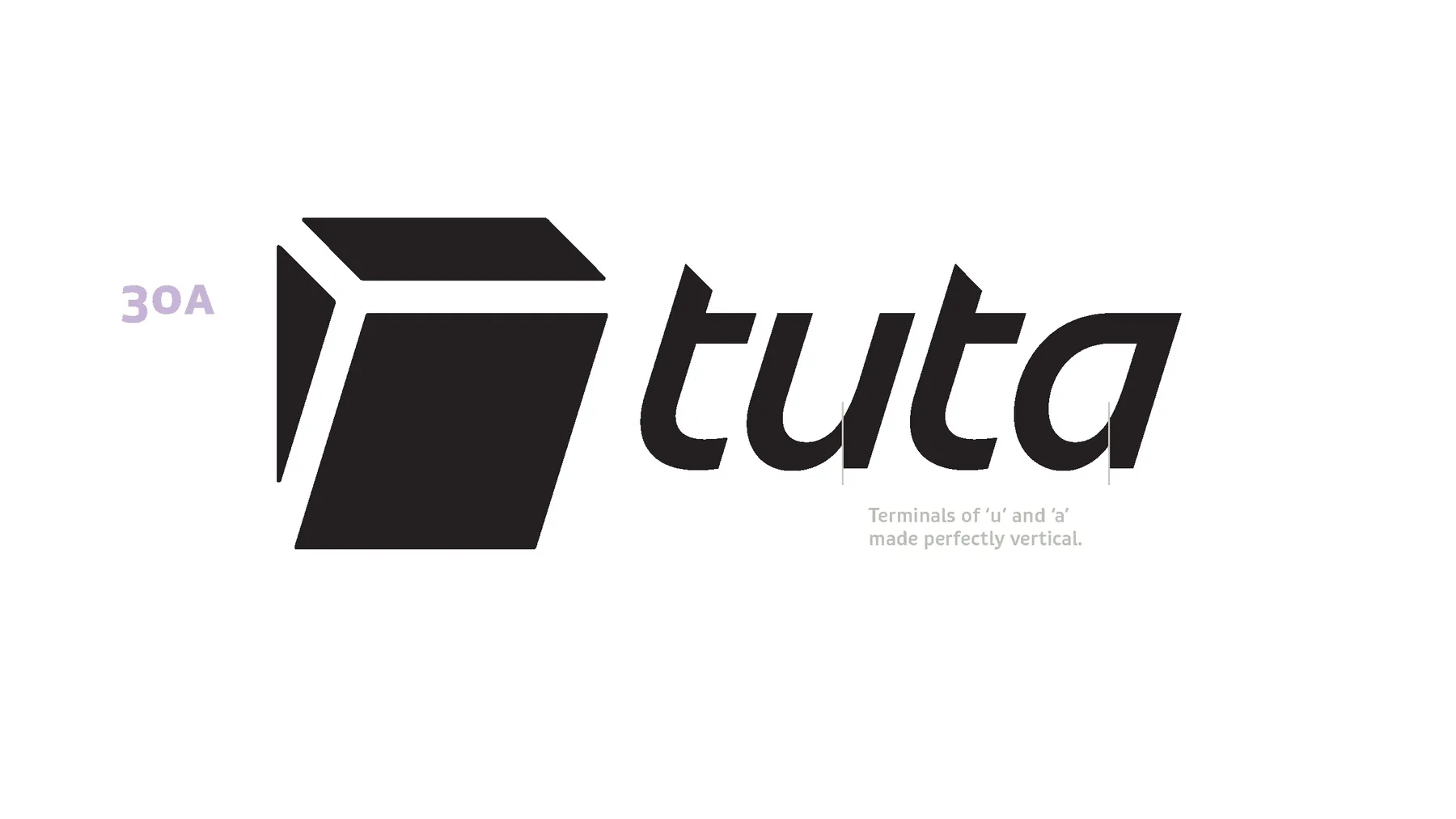
1. Signet: a bold (and not obvious) analogy
Because logos don’t claim to be realistic illustrations, there’s a lot of room for subjectivity, and the interpretation/feeling of the beholder. Sometimes we’re even surprised when we discover that a logo we like represents something we never imagined. That’s why we sometimes like logos without being sure of what exactly they actually represent - just their shape, composition or the emotion they convey can be enough to gain our sympathy and trust. Can you tell me, for instance, what the Nike signet is? Maybe not, and maybe you like it anyway.
In 2023, we changed our name from Tutanota to Tuta. The shorter name also set a minimalist tone in the visuals, so we sought a formal simplicity that would translate Tuta’s mission: accessible privacy for all. It was with this premise in mind that - after intensive branding strategy - we came up with a graphic representation of this item so present in our daily lives, worldwide easy to activate with just the touch of a finger.
Stylistically, the Tuta switch has no commitment to being illustrative, and even less does it seek to be a realistic representation of this object, but rather is a minimalist abstraction that isolates some properties and behavior of this apparatus.
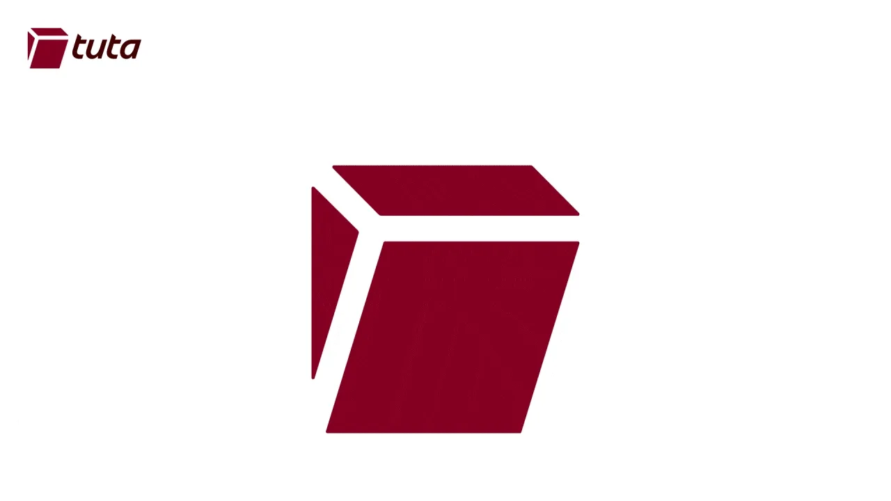
Although minimalist, this representation sought to geometrically preserve the basic physical functioning of a switch, in a way that was still recognizable enough to play with a motion storytelling - by vertically inverting the original shape position - in the sense of ON / OFF positions, messaging “Turn ON Privacy” / “Turn OFF Surveillance”.

As the front view of a switch would have manly straight lines and less visual dynamics, we chose to work with the switch in a side view, obtaining more diagonal axes to work with. With that, it’s as if we were looking at the switch from a position to the left of it under a Oblique projection Oblique projection. - coming from the Parallel projections Parallel projections family - in which the rays of the it are not perpendicular to the image plane like it would be in a realistic perspective, resulting in a non-distorted perspective, and therefore at a parallel angle.

The Isometric projection Isometric projection — often used for video-games and illustrated maps — It is often used to obtain an aerial view of objects, but we didn’t want that but a side view of the switch. To achieve that, we used another Parallel projection: the Cabinet 45 degrees.
To delve deeper into this topic, it’s worth checking out this guide to video game projections. And if you want to learn even more about 3D projections of objects, be sure to check out this brilliant article entitled Understanding isometric illustration.

A concern with the new symbol, was that it should not be confused with something negative or we wouldn’t like to be associated with. During perception tests with audience, no undesired association was identified.
Ease of use is a quality that is always sought after here at Tuta. What object could better bring this notion of choosing the private sphere with such usability? The goal of broadening the audience and giving access to privacy to everyone was also considered when choosing this universal symbol. The animation that inverts the Tuta’s new signet plays on the storytelling of the brand’s tagline, “Turn on Privacy”.
2. Wordmark: custom-made lower case type
Once we had finalized the design of the symbol, the challenge was to think of the best way to create typographically harmonious letters for the switch, thus, completing the design of the new logo. Using lowercase, as well as typefaces inspired by cursive was a way of conveying informality, a friendlier way of presenting this small word with a big meaning: secure.

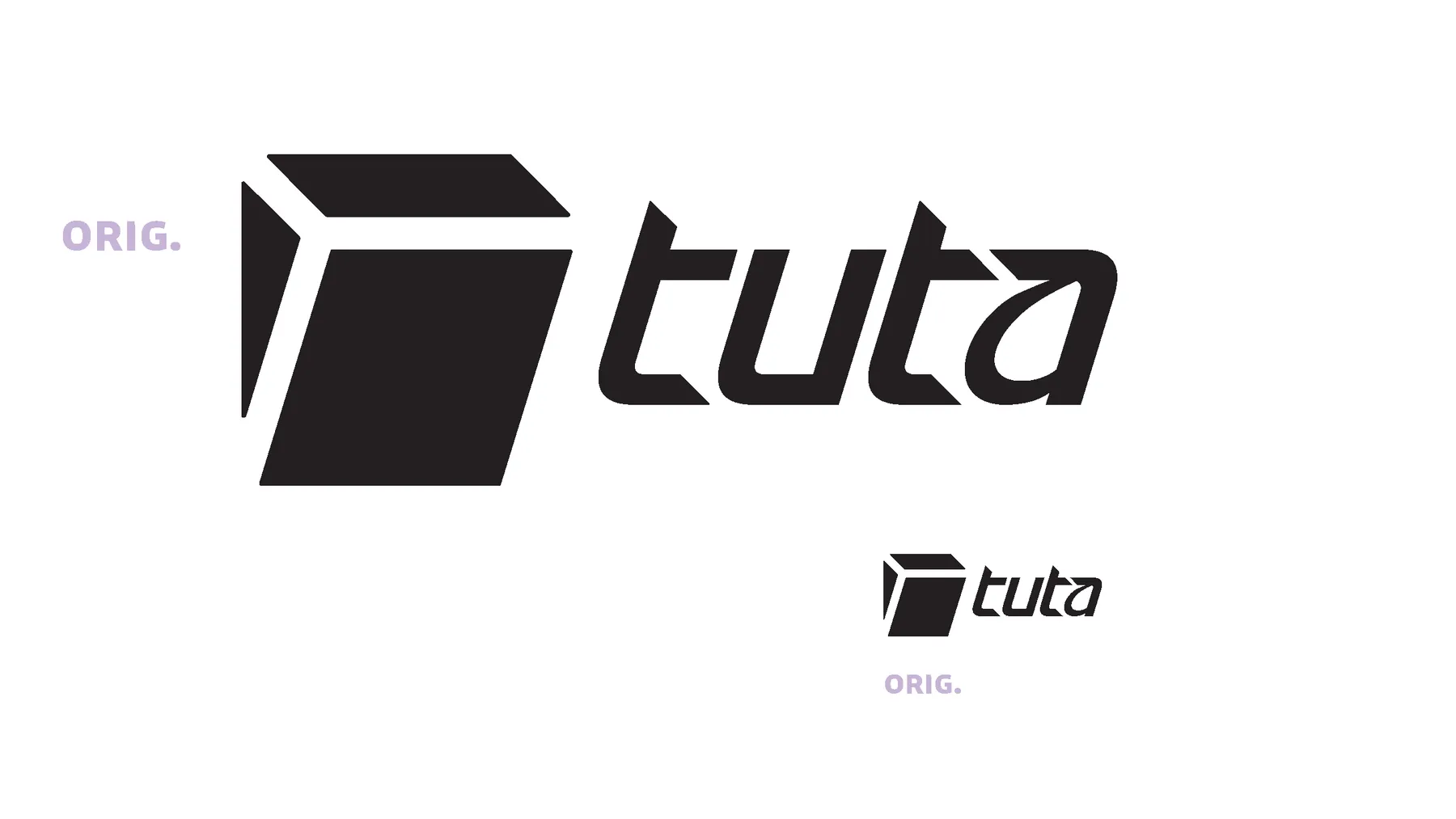

Partnership. Fabio Haag studio was then tasked with exploring our original wordmark draft, iterating typographically to give it more personality and a good readability.
Because our symbol is geometric, we balanced this by designing a type to bring contrast to the composition, offering more organic and expressive shapes, such as the ‘a’, which was inspired by the handwritten letter ‘a’. The diagonal angles of the switch naturally led the type to the italic axis. The Tuta wordmark was customized for our symbol, so the diagonals directly influenced not only the axis of the letters, but also the cutting of the apexes and ends of the letter ‘t’. For this mission, we relied on the talents of type designer Fabio Haag who did an excellent job.
![]()
![]()
3. Colors & Fonts: more shades and contrast
The fight against tech giants, the mission to deGoogle, is not a cold one, and our approach to this challenge is far from lukewarm. To achieve the energy needed for this mission, we expanded our color palette.
![]()
![]()
The old symbol suffered from a technical problem: at small sizes, the end of the path disappeared optically, as the detail of the last curve became too small to be legible. The minimalism of the new symbol and the more generous, straight gaps make the new logo easy to read at really small sizes without suffering from pixel distortion.
The reading of the wordmark “tuta” has significantly gained in presence and consistency, compared to the typography that was previously less connected to the symbol and had a more fragmented reading, as it mixed two different font weights.
Our old color scheme was cold and monotone, using only one shade of red, supported by white and grey backgrounds. With a more dynamic range, we better rely on the energy of colors to drive our fight for privacy.
The classic wine red color has been preserved and a new black loaded with red has been updated to replace the old 100% black. We also have added more layers of intensity to the original wine color, now also with secondary shades of red, magenta, and rosa colors. Saturated colors like the vibrant red dubbed ‘Fighter’ are combined with the sunny mood of orange, yellow and the coziness feeling of beige and peach tones. It is with this ‘human friendly mood’ in mind that we sought to counter the impersonality that hovered over the white and grey as background colors. This decision is in line with the way we see our mission, one of very human nature. Because for us, privacy is really about people, and their basic right.

We have also taken the first step towards better corporate typography. Our old typeface was a system sans serif. To maintain universality and performance, but bring a bit more typographic contrast, we opted for Noto in Sans and Serif SC variations. This is the the first step towards a typographic system thought, especially for the new brand. And on the new website it is possibly to realize a more interesting typographic hierarchy.
4. Imagery: monochrome underground meets warm pop
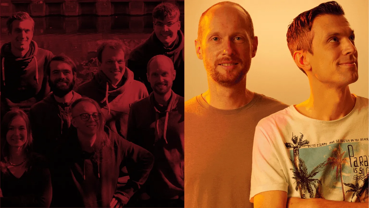
Visually, our creative decisions reflect a certain preservation of our punk-hackish look, bringing pop notes to the ‘band’, for example in the new colors and illustrations. Our brand has now authentic imagery and we will avoid generic image database as much as possible. Our team is the one who illustrates our values, and for this we are working with local photographers, such Alireza Husseini, who took the team photos for the new website. The illustrations and iconography will follow the same authorial line, we are working with local illustrators, such as Mel Wilken from Hannover, and international ones, like Feu who is from Brazil.
Tuta has always stood out for being a more human brand among tech companies. Both in the sense of its less commercial values and in its friendlier look reflected in being a small collective of people with a daring mission that defies the logic of big tech.
It was a decision between Tuta and the other kid around. I browsed each website to get a feel; I preferred Tuta friendliness and knowledge-sharing-oriented culture to the other one, which seemed more commercial. The human side of Tuta made me go that way-humanity over profit feeling I have not been disappointed.”
cdrc @cdrc@tux.social, Mar 10, 2024

The stencil look that has been present since the previous brand definitely brings an underground value that fits with Tuta’s privacy revolution positioning.
In this punkish protest stance towards the market, we’ve tried to preserve the essence of this underground look, such as the team’s stencil illustrations, because it reflects the still underground position of fighting against corporate giants. We love being a small company, we love being alternative, we love the underground, but that doesn’t mean we want to limit our solutions to a niche, but rather to extend our reach by raising awareness and enabling privacy on the web.
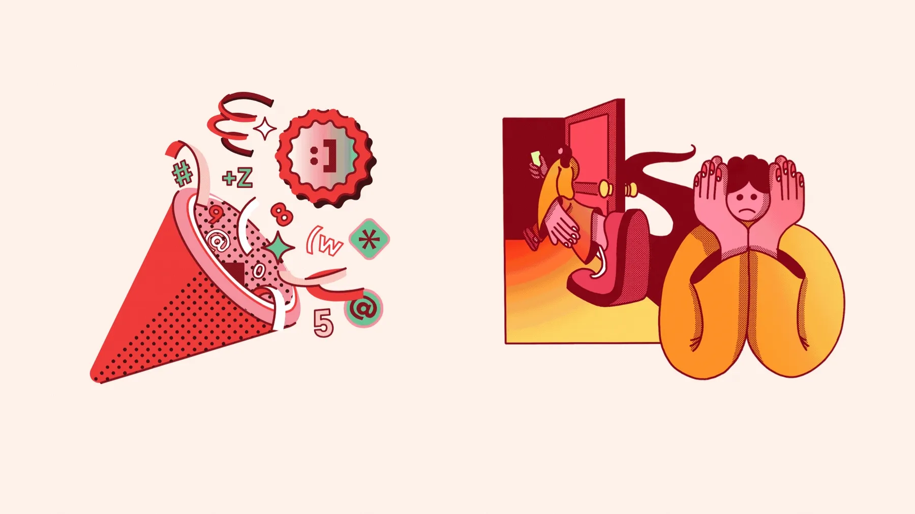
Our new illustrations work with the concept of contrast between light and shadow / public and private, through shading done with the pointillism technique (concentration of dark dots to create shadows). Also using our new, more dynamic color palette.
Rebranding phases and future products
How much branding an app icon needs is relative, and can depend on different factors, from strategic to formal. Bringing visual consistency between a brand and its products is possible in different ways, for example through colors, illustration style, and typography. During our rebranding process, we realized that we wanted to bring our brand to the products on a shape level as well. For this reason, the icons of the Tuta products are derived from the grid of the brand signet, and partly have the same structure. The Tuta app family are distinguished by their color system and their first characters, such as “M” for mail and “31” for calendar.
![]()
![]()
We are currently in phase 3 of our rebranding, called Brand Development. Our process has been divided into four phases which we have named as follows:
- Brand Audit (analyzing the old brand)
- Brand Creation (creating the new logo: symbol, wordmark and colors)
- Brand Development (extending the new creative direction to all brand assets and products)
- Brand Implementation (adopting a consistent design system)
The rebranding process counted on the participation of the entire team in several workshops, in all phases, but especially in the Brand Audit phase.

Under the motto encryption of everything and for everyone, many new features are coming with Tuta’s new product ecosystem. Inaugurating the family with Tuta Mail and Tuta Calendar.
As the next main rebranding step we will start to work even more directly on the product’s UX/UI, i.e. aligning our apps with our new creative direction.
Here at Tuta, we’re all excited about the growth of our encrypted ecosystem products, meeting demands of different people and groups, such as businesses, medical clinics, activists, and journalists. In the next few design posts, we’ll go into more detail about the upcoming releases, showing how they positively impact your experience with Tuta’s encrypted solutions.