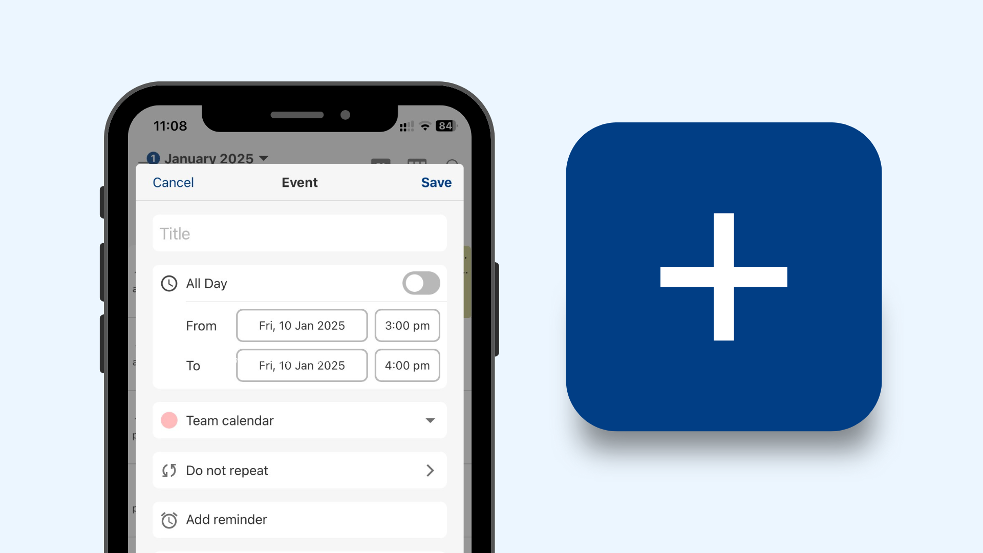
The Tuta Calendar is the most secure and most private calendar that you can find to manage all your events - whether for work or for your private life, it’s even a perfect family calendar. But it is - not yet - the easiest to use. We are making 2025 the year that this is going to change - and we kick off this change with amazing UI improvements for the event creation in the Tuta Calendar. Stay tuned for more updates in 2025!!!
What’s the big deal about the event creation flow?
When you want to add a new event to your calendar, the process is typically straightforward, right? You tap a button, enter the event details, pick a time, maybe add some reminders, and voilà, you’re done. But if you’re managing many appointments, deadlines, and events, that process can start feeling like a bit of a chore. You might find yourself clicking through multiple screens, filling out tons of fields, and then just wishing for something faster.
This is where the UI improvement comes in: a streamlined, single-screen event creation form. Imagine opening the event creation screen and seeing just the essentials upfront, with everything you need in one organized view. Everything is right there, clearly labelled, and ready for you to fill out.
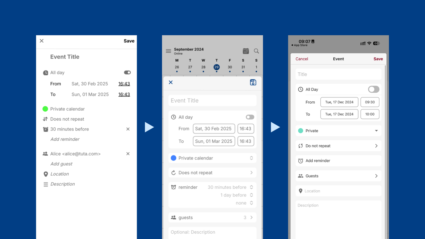

The UI iterations of the new Event Editor.
How does the new UI work?
Here’s how this improvement would work in action:
-
Minimalist Design – The first thing you’ll notice is the clean, uncluttered design. You’ll see only the most important fields upfront: event title, date and time, calendar name, repetition, summary of guests, location and description. No scrolling or excessive tabs needed.
-
Block Grouping – Fields are grouped according to their role in event creation, so you can find everything you need in one place and organized by blocks of information types.
-
Quick Add for Recurring Events – Planning a weekly yoga class or monthly team meeting? With a much simpler page, choose your rules or customize them as you need!
-
Inline Options – Need to set a reminder? Instead of jumping to another screen, you can just tap to add reminders, and they’ll show up right below the main details. Super fast to edit and super easy to visualize!
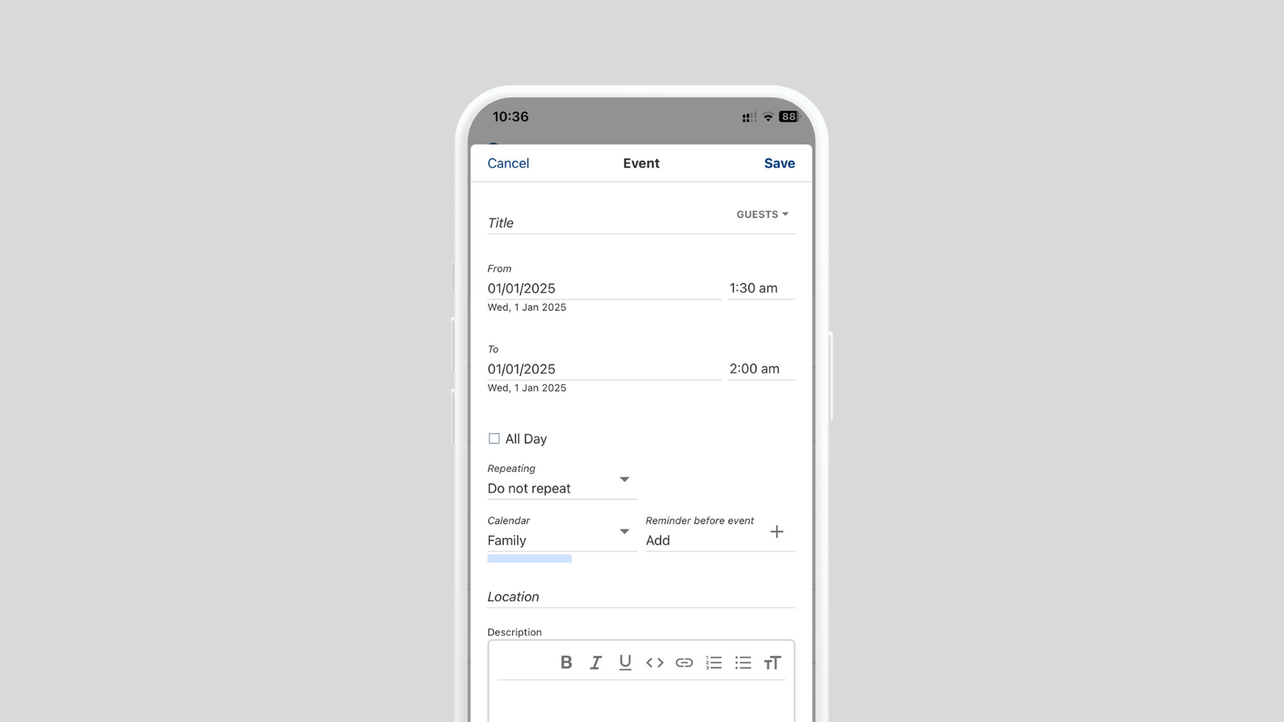

The old UI had less clear visual hierarchy, and therefore a less intuitive UX.
The old vs. the new: A big leap in UI/UX
Let’s break down the old UI vs. the new UI because the difference in usability is truly significant.
Old UI: Arid and complex to navigate
-
Low Visual Hierarchy: All the fields - title, time, place, reminders and others - are crammed together with no enough visual differentiation, except for the order in which they appear. This made it difficult and time-consuming to discern each block of information, and was caused also because of a not good padding to flow smoothly the reading.
-
Scrolling Chaos: Key fields (like time and location) might be buried under less important options, requiring unnecessary scrolling to access.
-
Complex Drop-downs and Settings: Adding recurring events, reminders, and descriptions often involves clicking through confusing menus and options, adding to the mental load.
-
Lack of Iconography: The exclusive use of text made the interface monotonous, with a loss of focus and slower informational process.
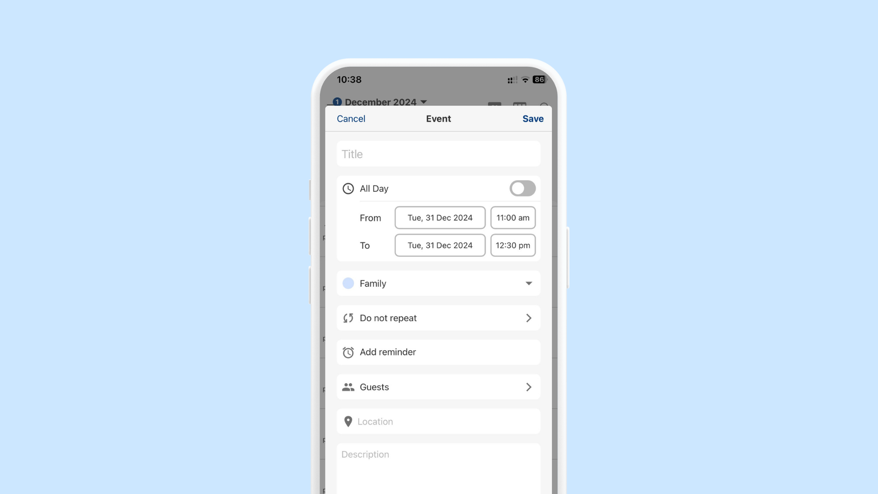

The new UI grouped informations per type, with improved alignment, spacing and iconography.
New UI: Clean, simple, and efficient
-
Clear Visual Hierarchy: We grouped blocks of information of the same type into containers. The most important fields—event title, date, and time—are placed front and in a single column, making it clear what you need to do first.
-
Alignment of Categories: Icons are like pears in a box full of different fruits. How would you visualize all the pears faster? Organizing and categorizing them. We’ve lined icons all up in a vertical left column, including the colour of the chosen calendar. As icons translate categories/actions in a visual way, finding each interaction is now quicker and less busy.
-
Inline Options: Additional settings like reminders and notes appear below the main event details, so you can add them without leaving the page.
-
Quick Recurring Event Setup: Adding repeating events is as simple as selecting a toggle or dropdown to set the frequency, without needing to dive into advanced settings.
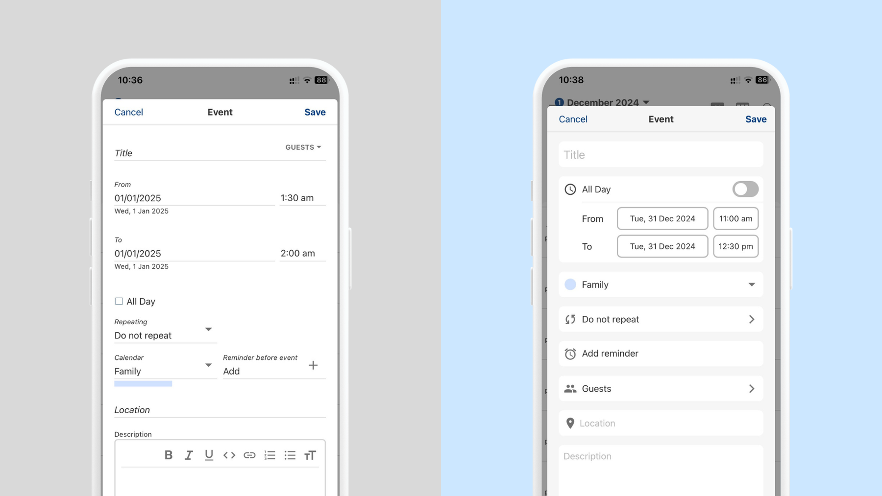

The old UI vs. The new UI: layout design principles applied for a better UX.
Why it’s a game-changer
This small adjustment can have a big impact on the time you spend managing your calendar. By simplifying the process of creating events, it allows you to do things more quickly, with less effort. You’ll be able to add events quickly without feeling overwhelmed by too many steps. What’s more, it reduces the mental burden of trying to navigate multiple screens and fields, allowing you to concentrate on what really matters: making your calendar work for you!
By continuously improving the Tuta Calendar, we make sure that it is not only the most private one but also the best Google calendar alternative.
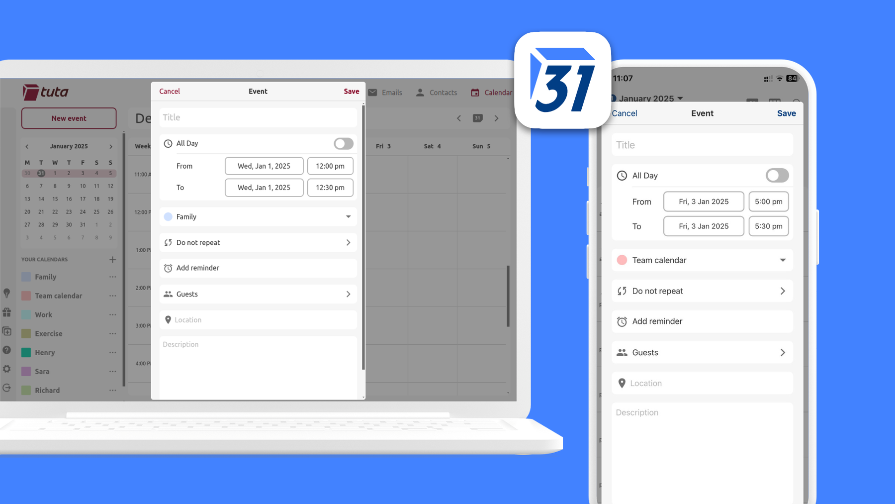

A whole new calendar experience on any device!
The bottom line
A cleaner, more intuitive calendar app experience isn’t just about aesthetics - it’s about making your life a little easier. So the next time you open your calendar to add an important meeting or fun plans for the weekend, remember that this process should be faster with a simplified user interface and a more fluid experience. That’s how we hope you feel.
This first major UI improvement is just the start of a new design system for Tuta, with more usability for our users and coherence for the brand ecosystem.
Are you ready for more UI/UX improvements? We certainly are!


