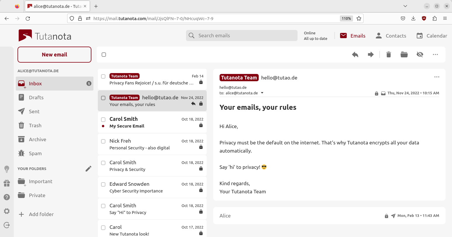
New design update brings nice improvements - not just in looks, also in functionality!
Quick actions have become much easier with our lighter design and its new toolbar.
At Tutanota we focus on doing security right: We are building the most secure email service that lets you secure all your data easily.
We do not want to build the most fancy and colorful email client, but one that lets you focus on your emails and calendars with a nice and open design.
Clear & simple design
Most of our users love our clear and simple design, however, we know it is never possible to satisfy all tastes. Nevertheless, there were a few usability issues with our previous design that needed fixing.
New email toolbar
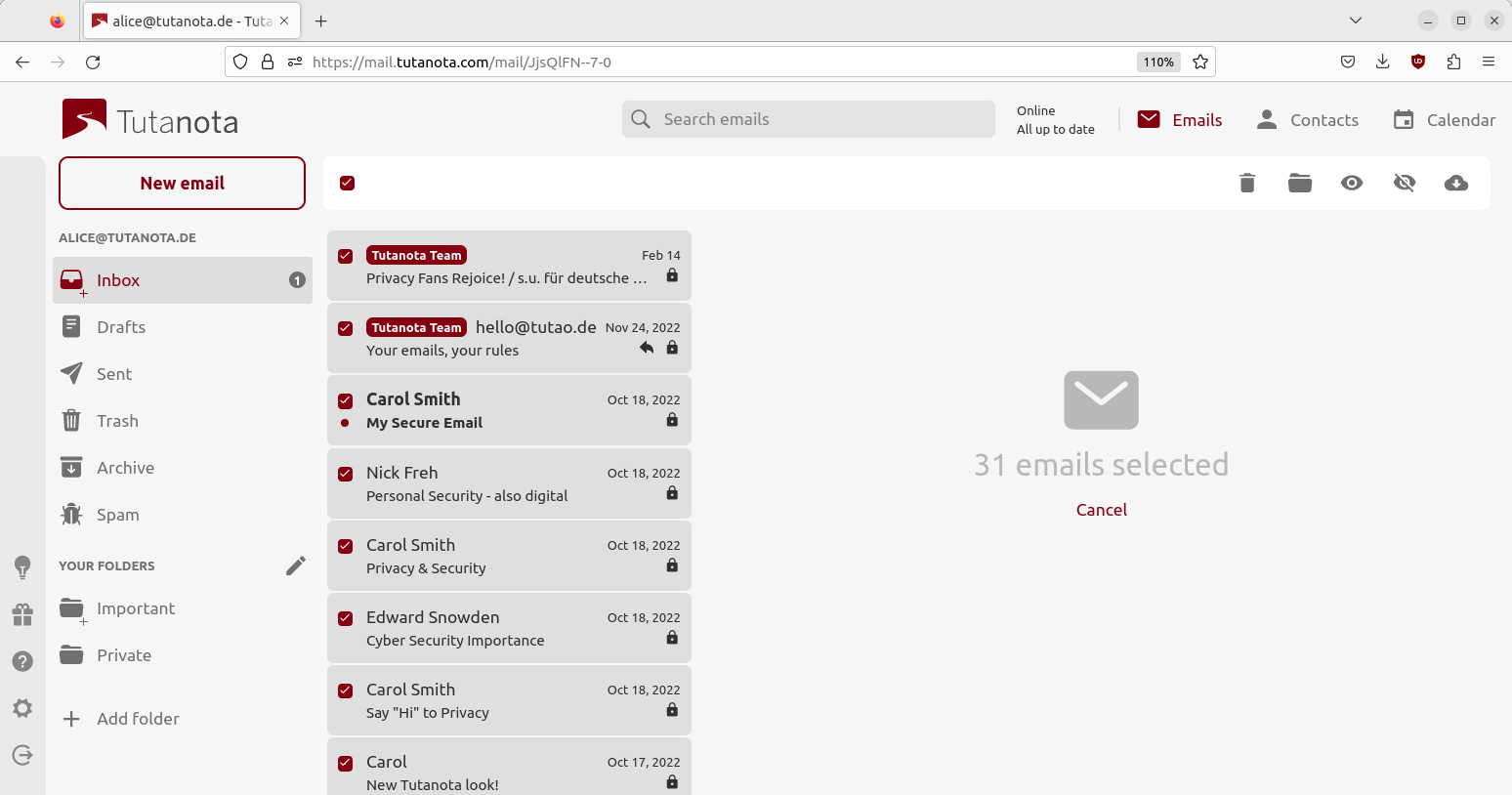

With the most recent design update, we have introduced a new toolbar that lets you perform quick actions in Tutanota:
- Multiselect
- Select all
Once you have emails selected, you are able to perform quick actions on all selected emails:
- Delete
- Move to selected folder
- Mark read
- Mark unread
- Download
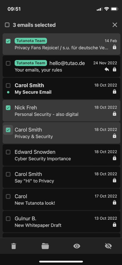

We will continue to work on this toolbar to provide even more functionality like filter for unread emails etc.
New contacts toolbar
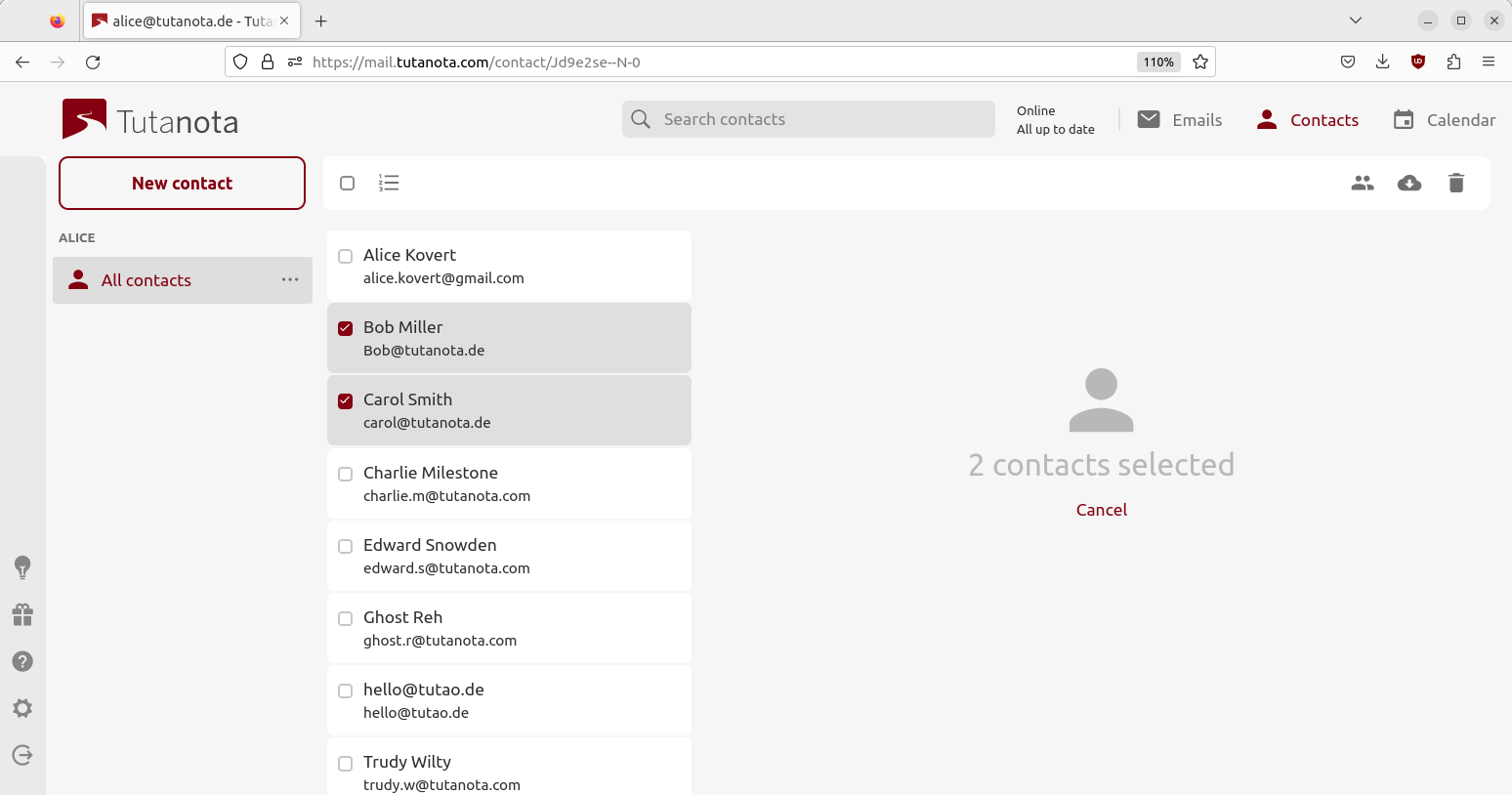

We have adapted the new toolbar also for contacts to improve your workflow here as well. Once you have selected multiple or all contacts, you can perform quick actions on selected contacts like:
- Merge
- Download
- Delete
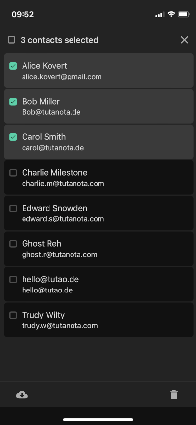

Hidden toolbar on mobile
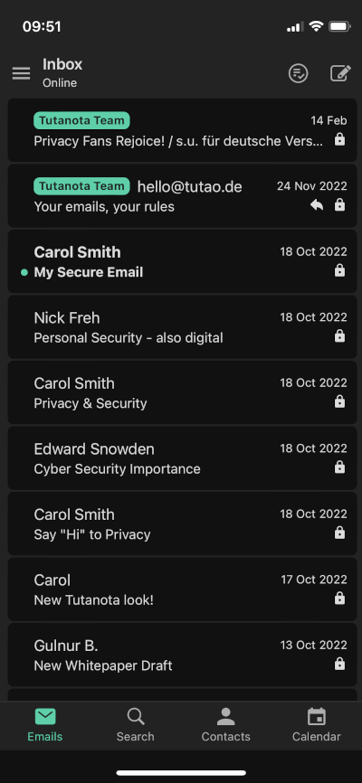
With this update, we have also hidden the recently introduced toolbar on mobile. Let us know whether you like this improvement as much as we do! 🥳
The list squares are only displayed once the first email has been selected - either with long press or via the button at the top.

What comes next
We are further optimizing the new look and functionalities so we’ll be happy to hear your feedback here in the comments or on social media.
Thank you! 🙏

